When you look at a body of work, the thing that gives it cohesion is usually a consistent anchor—a thread. This could be a color, a subject, a visual style—something that ties everything together so that, as the viewer moves through it, the work speaks with one voice.
This is something I used to get hung up on constantly. I was always worried about “finding my voice.” So much so that I let the pressure of it take up way too much space. It got in the way of simply enjoying photography.
Eventually, I burnt myself out. I had no more energy to give to “figuring it out.” So I stopped overthinking. I just kept shooting. Less analyzing, more doing. And of course—that’s when it hit me.
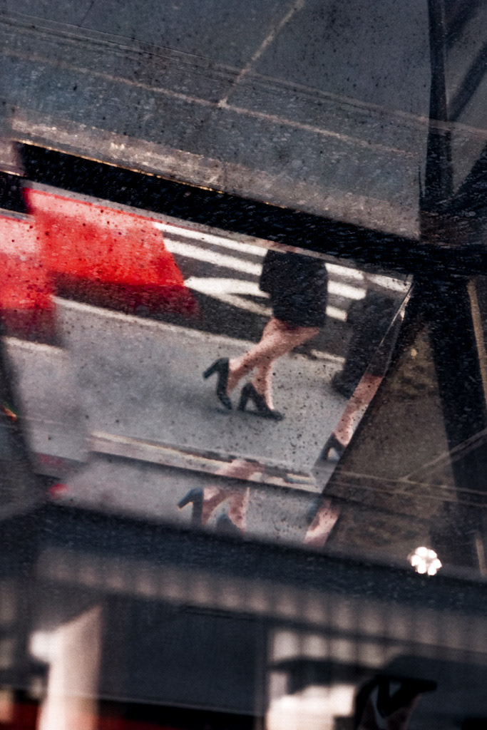
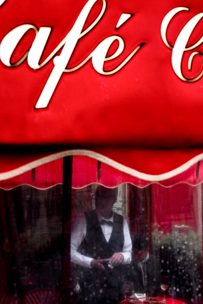
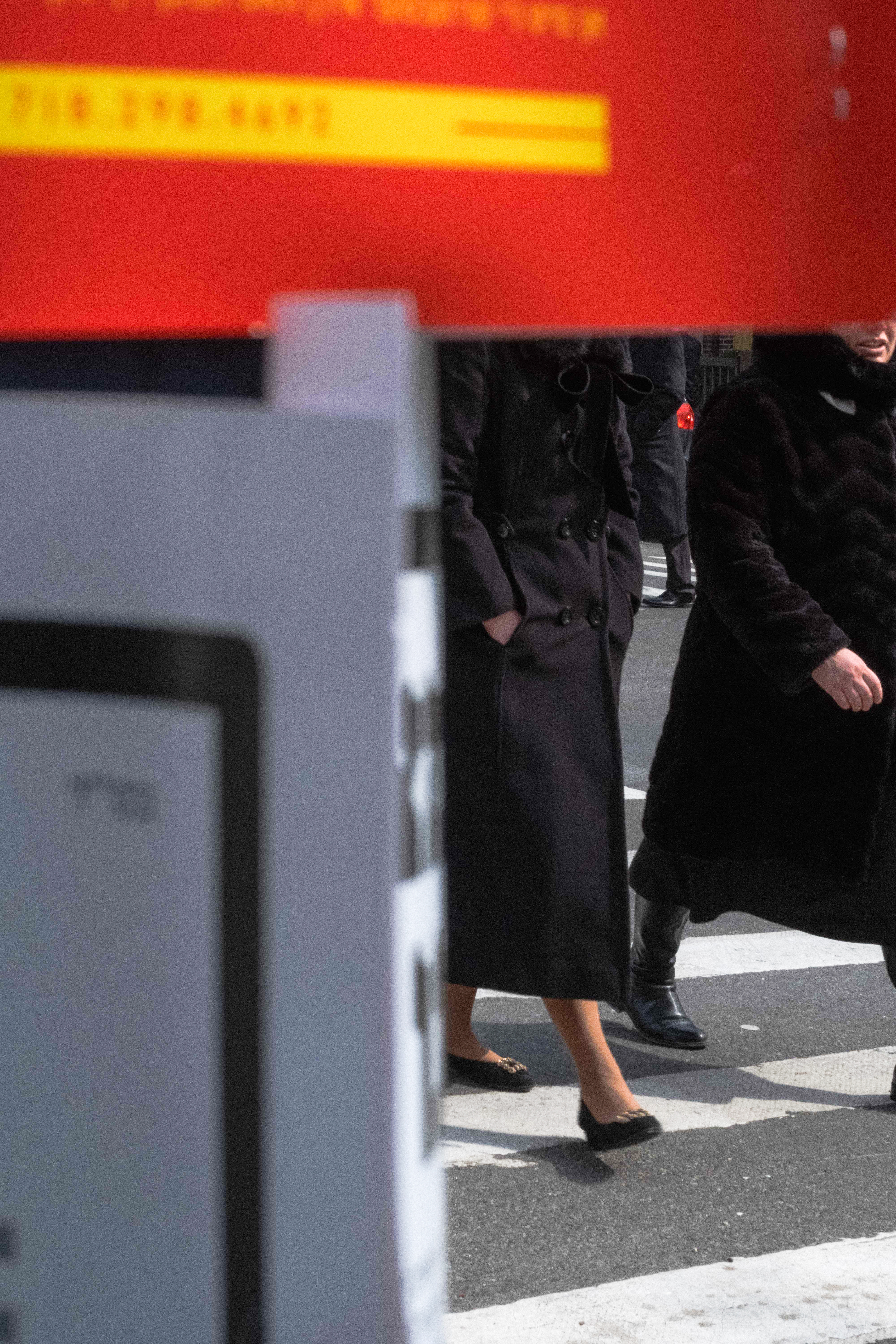
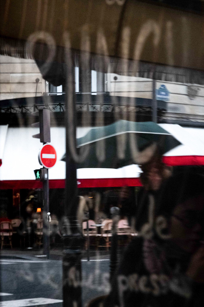
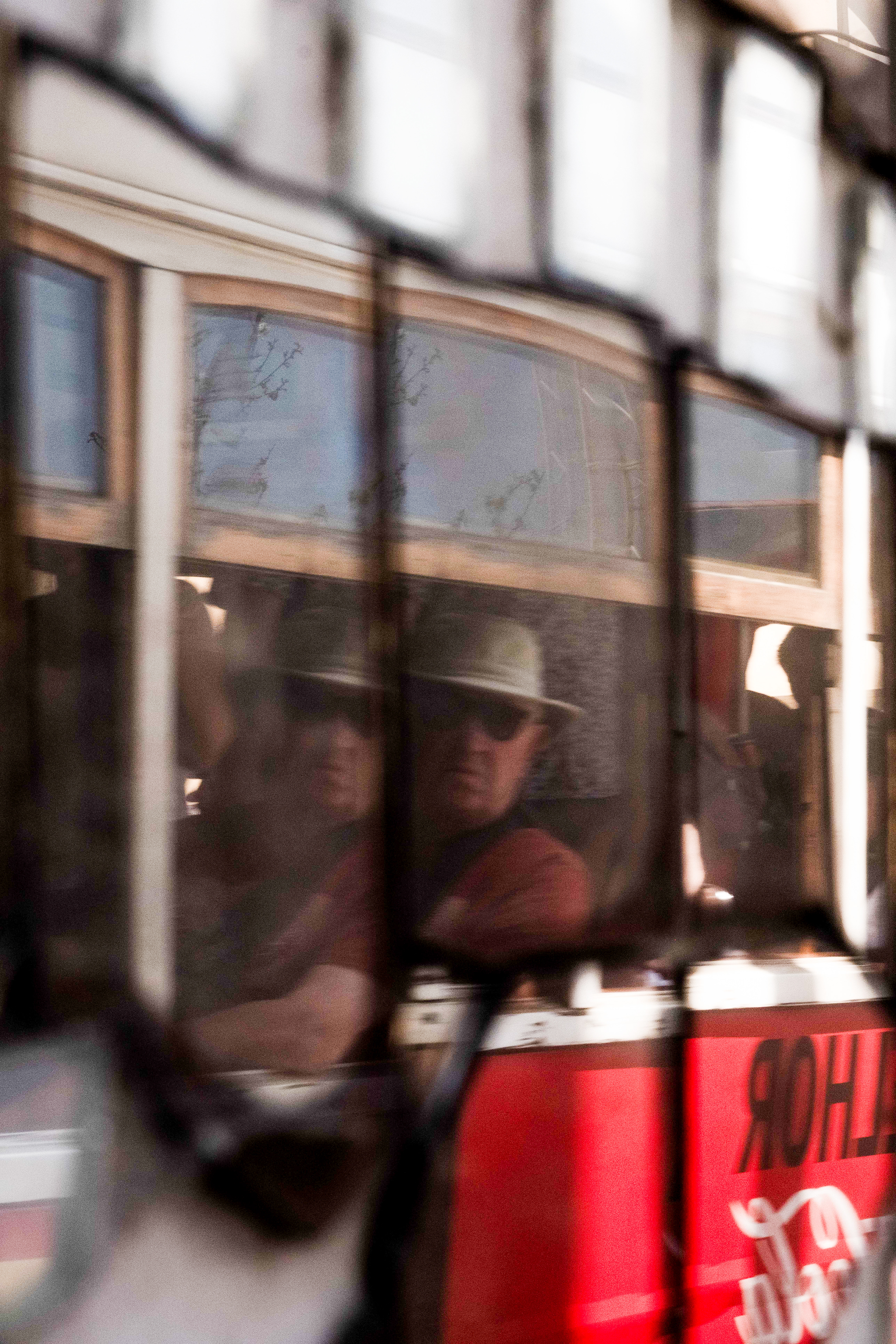
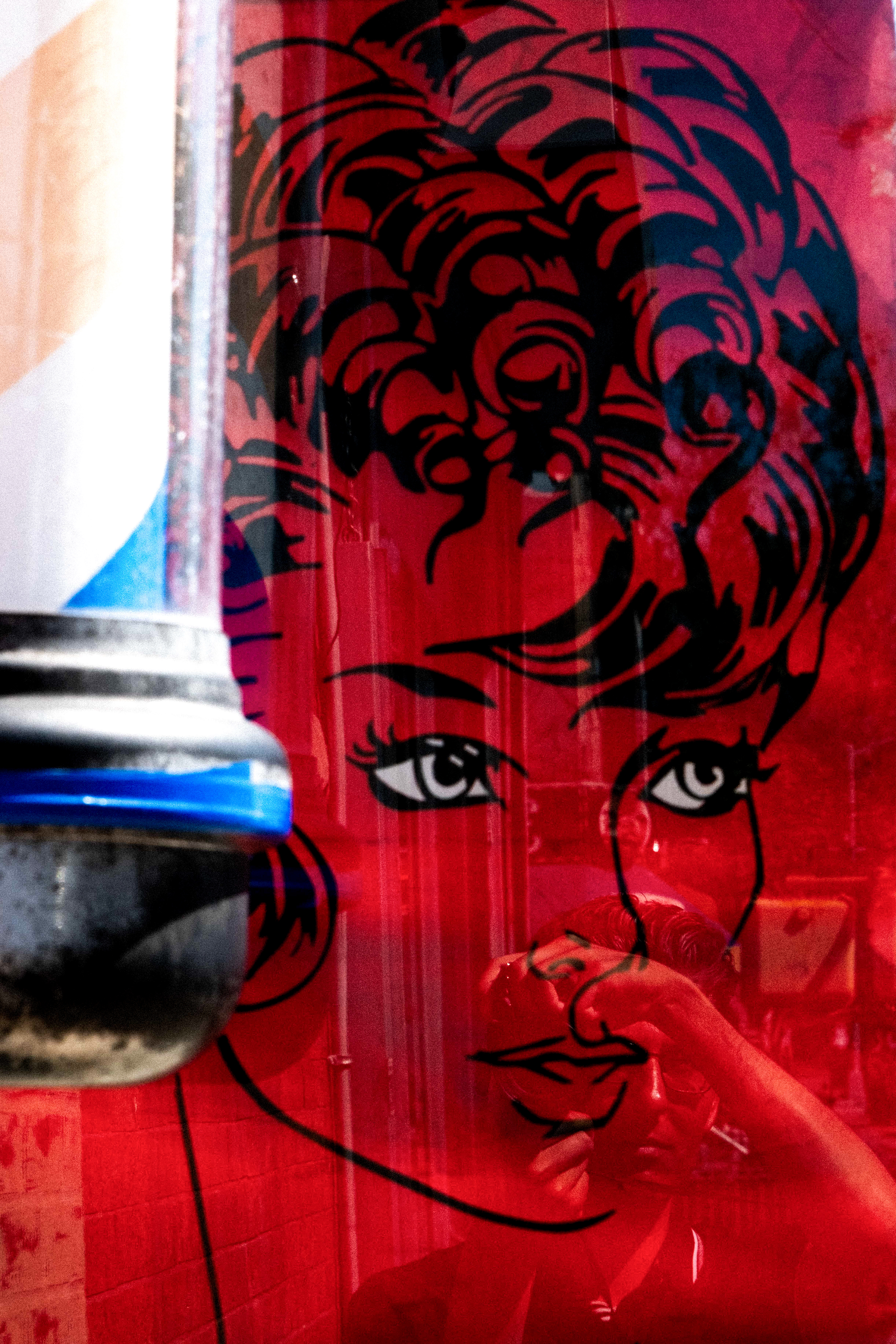
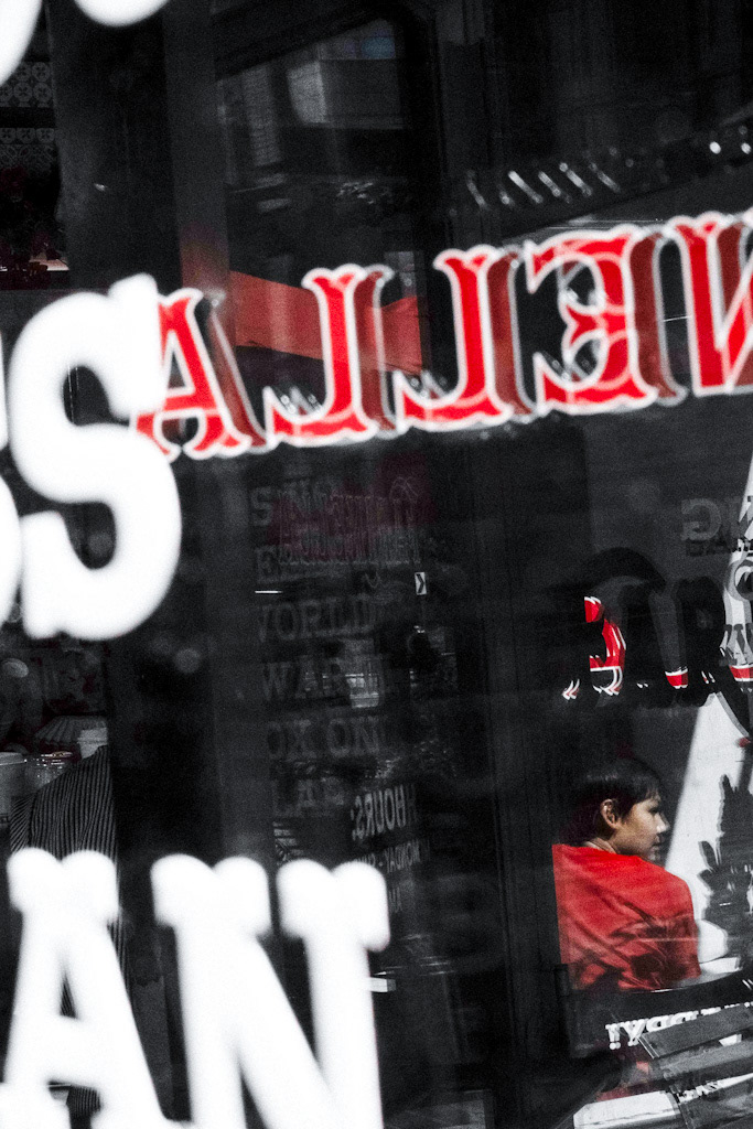
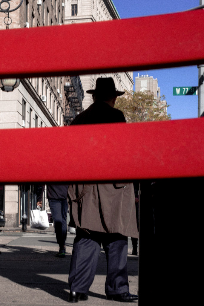
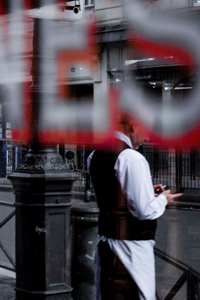
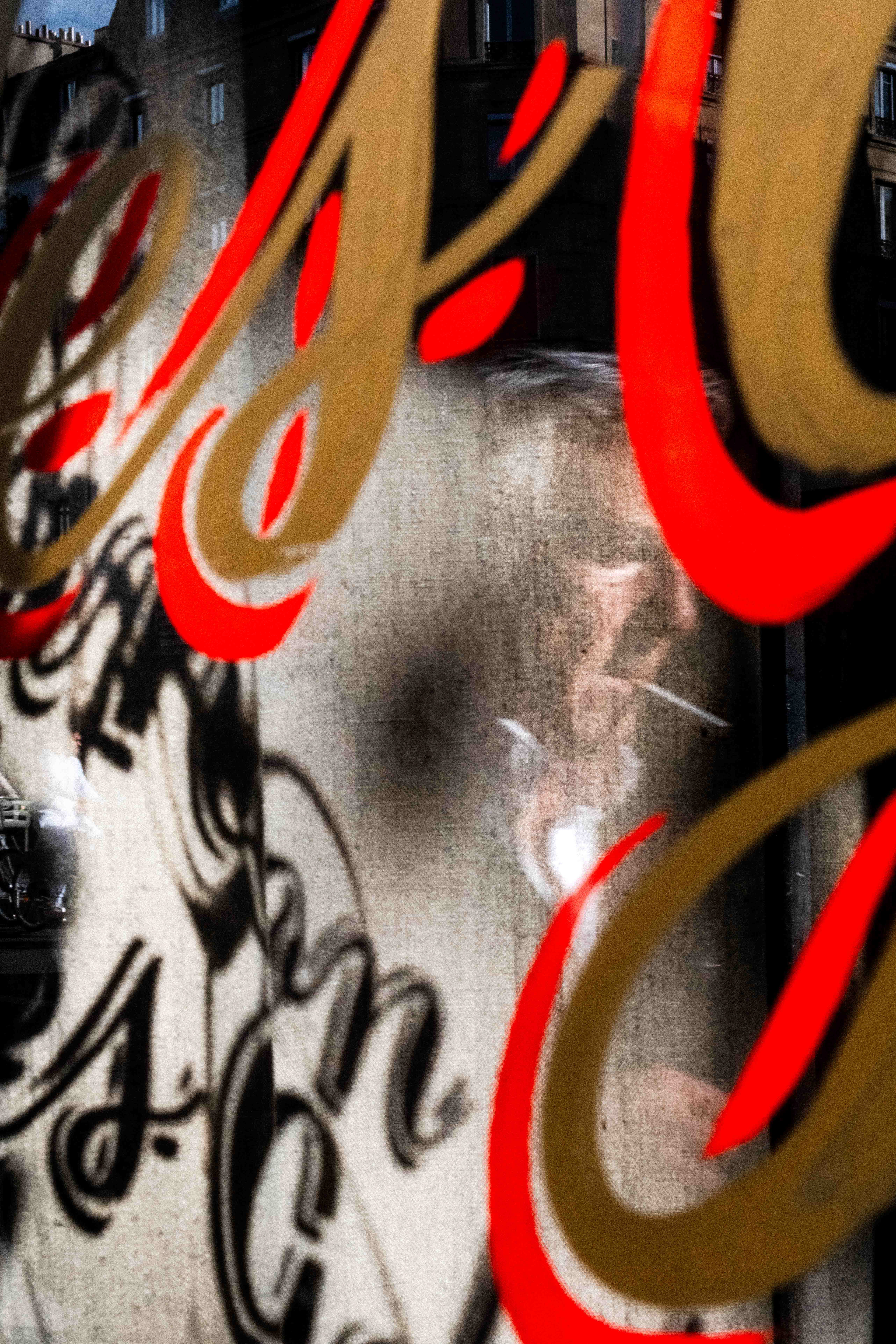
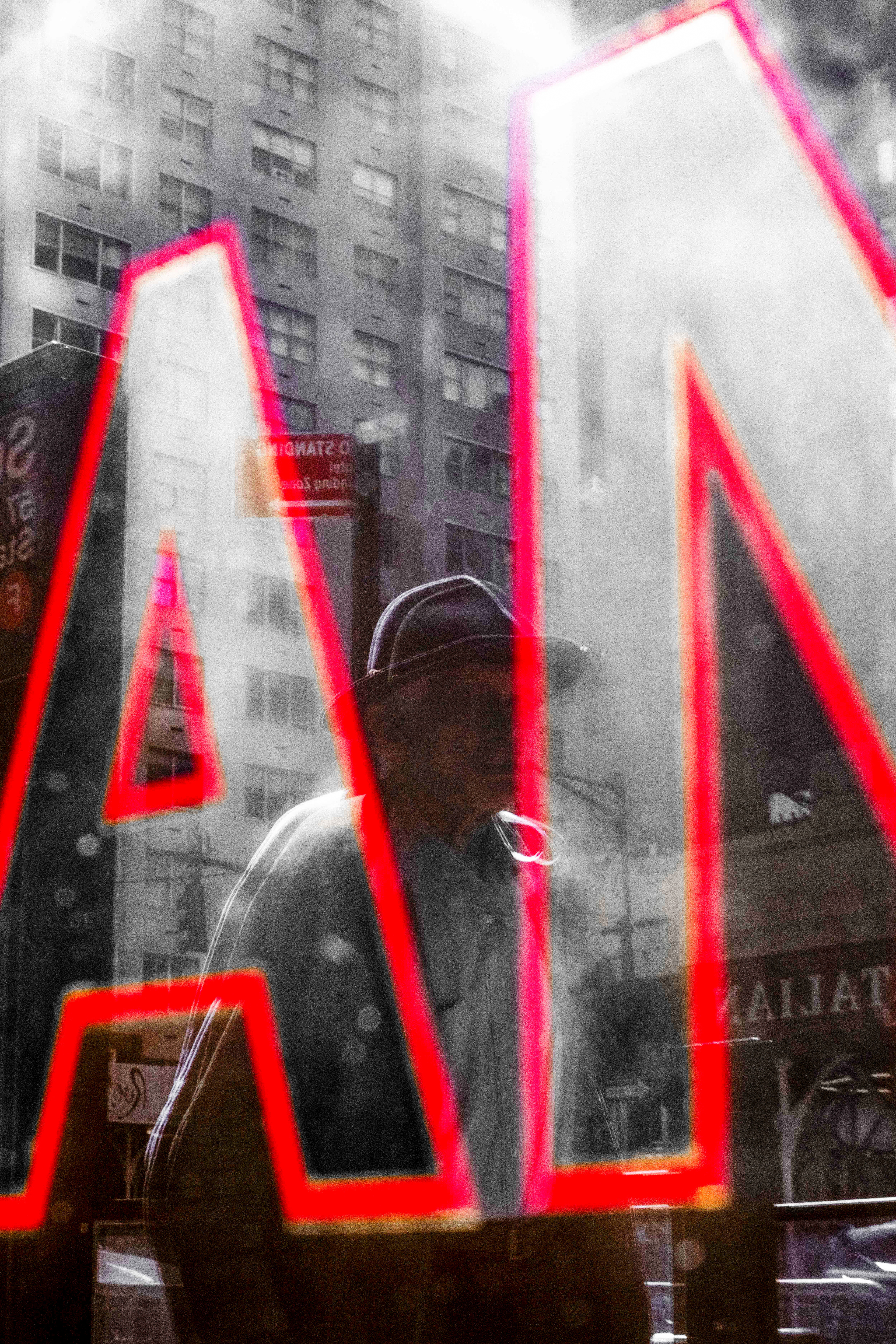
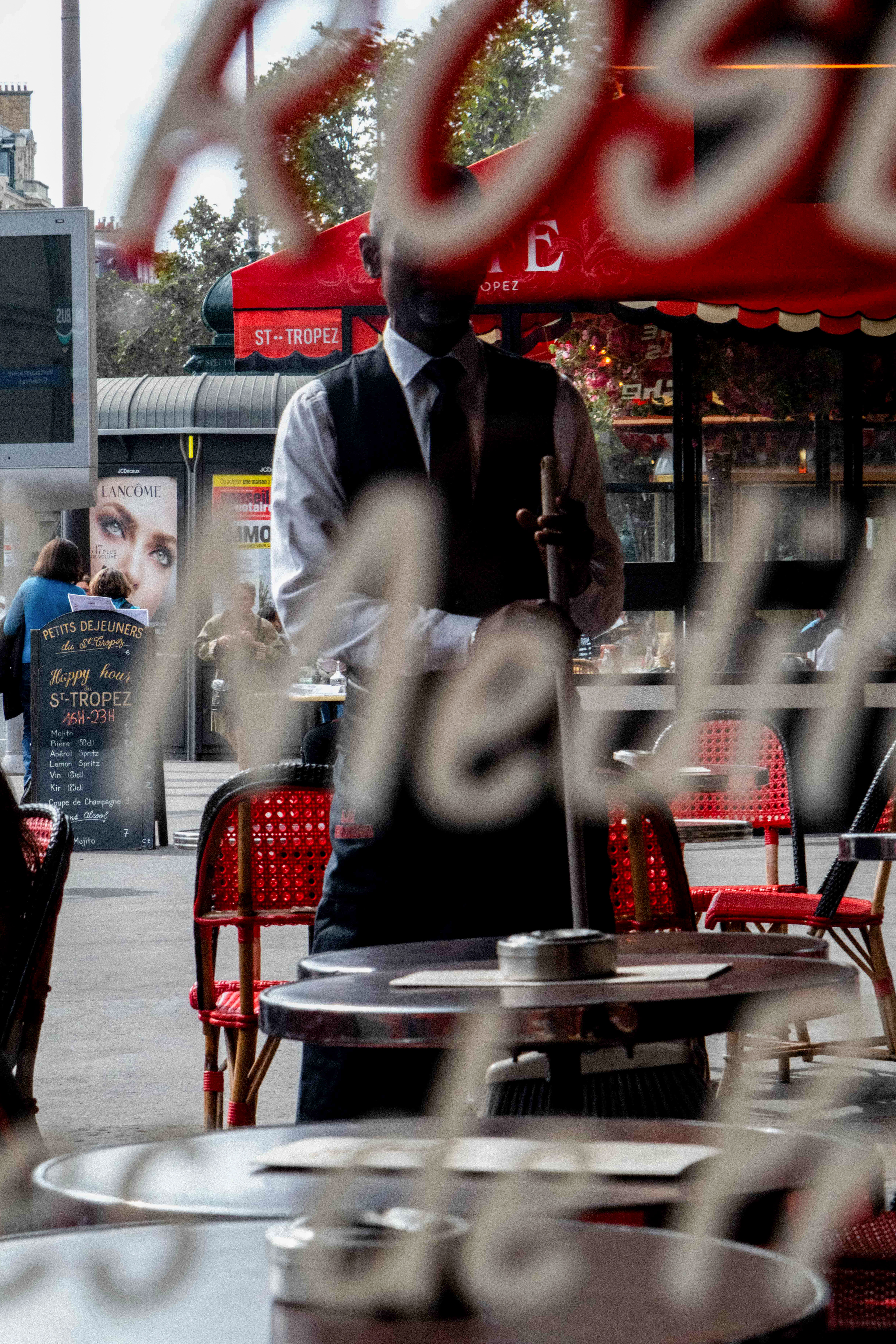
After creating so many images over time, a consistent thread started to emerge on its own. The color red. Boom—there it was. I had found my anchor. Not by chasing it, not by planning for it, but by making thousands of photos and letting patterns surface naturally.
Whether red stood out because it was the only color present that day, or because my eye was subconsciously drawn to it, it didn’t matter. It was there. Repeating. Showing up in different ways. That thread became the thing that tied the work together and gave it a recognizable look.
Eventually, other people started noticing it too. I’d get comments on Instagram pointing out the color, how it stood out in my images. It started to feel like part of my aesthetic—something that helped shape my visual identity.
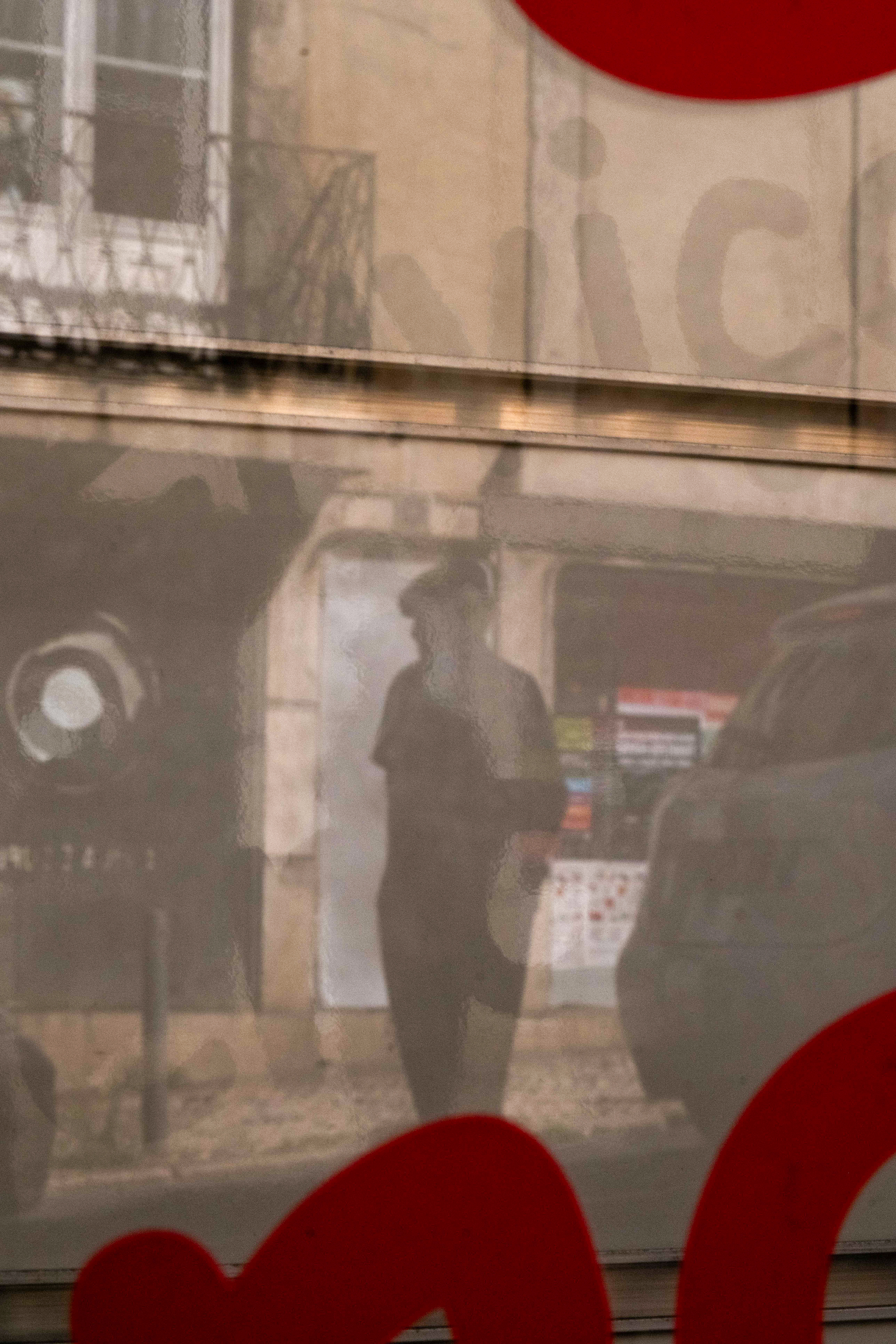
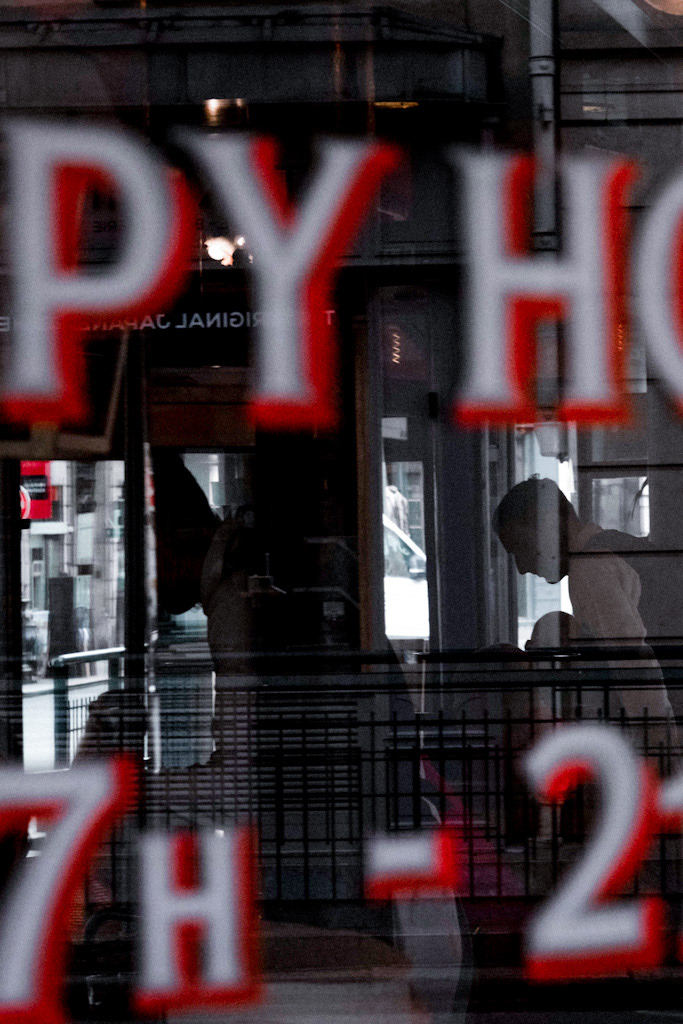
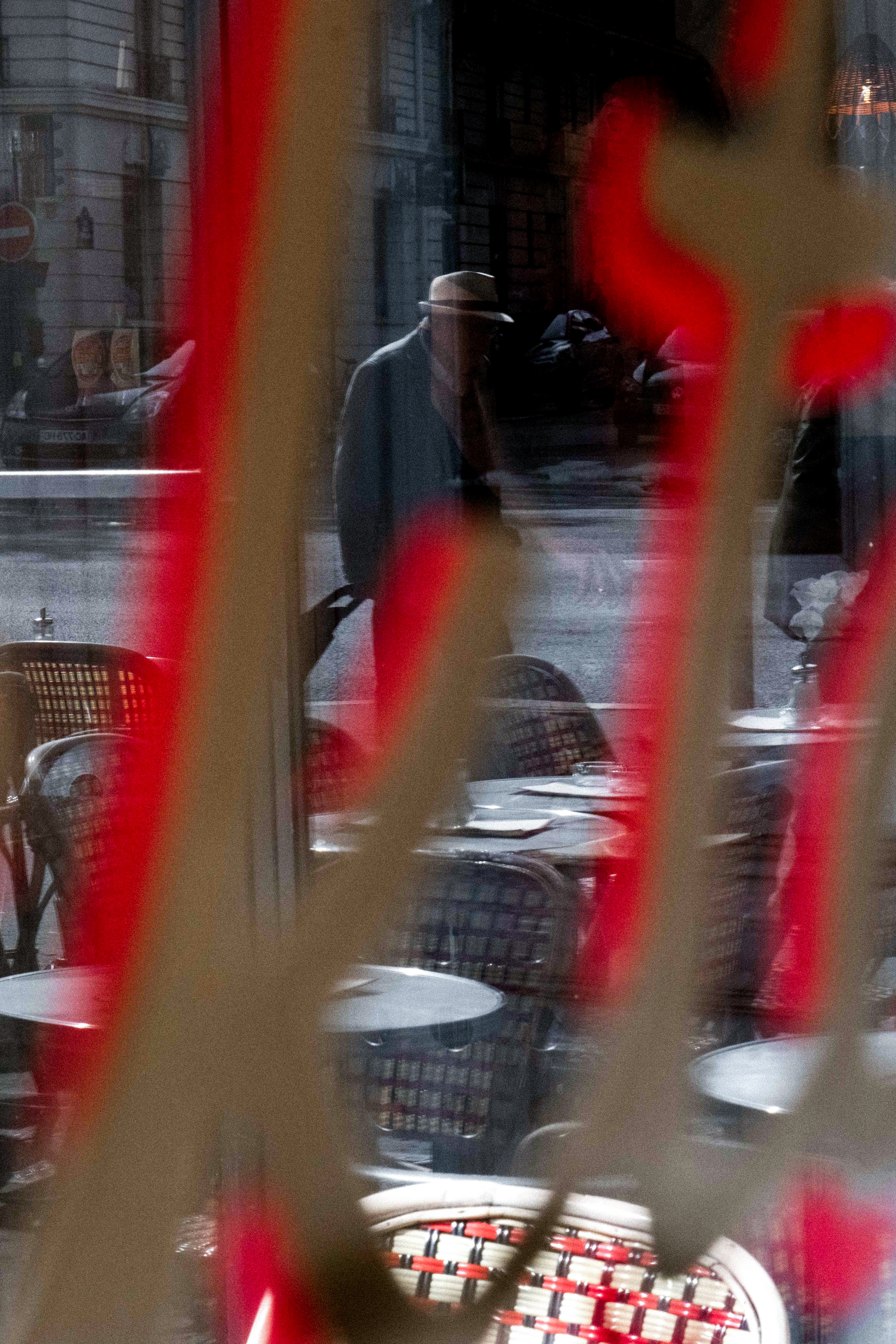
It’s not something I put front and center. It’s not always loud. But that’s what I like about it. It’s woven in. It gives the work rhythm and pulse. Even when everything else shifts—the city, the light, the season—there’s usually a sliver of red somewhere in the frame.
What I’ve learned about color is that it becomes its own language. You begin to feel what it communicates—not just visually, but emotionally. Red carries weight. It’s heat. It’s urgency. It can be romantic, dangerous, lonely, or even mundane, depending on how it’s used. Sometimes it’s the subject. Other times, it’s just punctuation.
When people ask me how to make their work feel more cohesive, I always say the same thing: stop chasing themes. Start noticing patterns. Chances are, the thread is already there—you just haven’t named it yet. Maybe it’s a time of day you keep returning to. A mood. A type of light. Or a color that shows up again and again whether you mean for it to or not.
Now that I’ve noticed it, I lean into it. If I see a flash of red, I slow down. Sometimes I wait for it. Sometimes I follow it. Either way, it’s become a kind of guide.
It also helps with editing. When I’m curating a set—for a blog, a gallery, or a zine—I look for the red. It helps hold the work together. Even if the photos were taken in different cities, or years apart, that one color makes them feel like they came from the same world.
So no—I didn’t choose red. Red chose me. Or maybe we just found each other. Either way, it became a quiet throughline. A consistent thread that keeps the work from feeling scattered, even when life is.
If you’re building a body of work, pay attention to what keeps showing up. The thread might already be there. All you have to do is follow it.